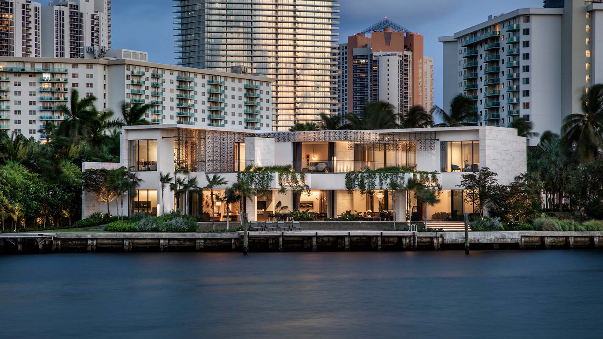
Crafted in soft light, Terracina blurs the lines between flamboyant contextual modernism, mediated into a jungly Miami landscape.
In the brutal environment of a Florida waterfront property (hurricanes, salt, humidity, torrential rain, Florida electricians), creating a luxurious sense of a home without feeling technical requires a light touch. This residence is lit both as a gallery and a home, while the exterior is almost accidental, a function of lighting of its landscape communicating back to the building.
With the owner also as the interior designer, joined up thinking was easier, but required positive negotiation, particularly as the client brief conflicted between husband and wife – one wanting bright, general light “like a stadium” and the other requesting subtle atmosphere. Controls provided some of the answer along with substantial wallwashing allowing high general light levels when desired. To minimize the apparent fixture count, linear fixtures wash east-west walls, punctual luminaires north-south. This gives a sense of place and cleaner ceilings.
The fingers of the house are separated by planting, itself lit in 3000K contrasting with the warm-dimming interiors. These exterior zones are activated by adjacent rooms, blurring interiors with exteriors. Each window has visual features outside, eliminating apparent reflection.
Timeclock scenes manage the overall tone of public spaces through the evening. Conditional programming allows single buttons in simple spaces (powder-rooms for example) to activate a time-appropriate scene.
Using wallwashing for the overall lighting strategy empowers the owner to change art and maintain their own lighting. In each room, one direction of walls is lit with punctual recessed wallwashers, and the other direction with a linear wallwasher, embedded in the thickness of the plaster ceiling. This latter approach permits ducts and other services to pass overhead, and helps air conditioning to disappear into the ceiling. The two different ways of lighting reduces the relentlessness of presence in the ceiling of the light necessary to illuminate the art collection.
The façade, potentially imposing in both in height and solidity is mediated in light. Lighting “accidentally” passing through the jungle, and out of water features breaks up the scale and creates intimacy. Where the garage blocks light from softer locations, a gentle uplighting is achieved by bouncing light off the garage roof, making a directionless indirect source. This soft glow above the garage eliminates a potential dark spot.
All exterior lighting is heavily shielded with snoots and louvers, and only minimal landscape lighting is oriented upwards towards open sky/trees, the vast majority is directed at the facade through planting, and dimmed for subtle effect, reducing light pollution – light trespass 15′ away being below 0.5fc. The façade itself, to the adjusted eye feels bright but is in fact below 3cd/m2 average at full, and generally run at a fraction of that level.